A key aspect to the design of a microfluidics cartridge that often goes overlooked is usability. How an end user interacts with the fluid sample, cartridge and instrument reader before, after and throughout the microfluidics assay protocol execution (process) can highly influence the quality and consistency of the result. Through examining the larger user experience involved in the microfluidics process, we can identify issues, and design these experiences to reduce the potential for user error, improve outcomes and create a simpler, more accessible process.
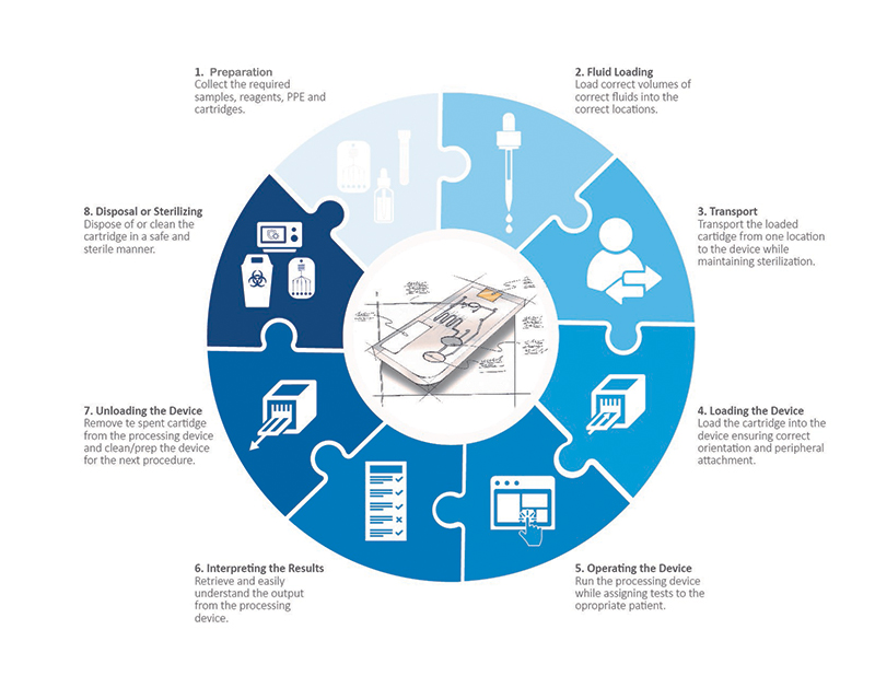
A typical microfluidics process is a complex series of interactions between the user, cartridge and processing device. To achieve the best results a user must:
- Learn and fully understand the typical instructions for use and protocol for the process
- Retrieve a sterilized cartridge
- Retrieve the correct samples and re-agents
- Load two or more fluids into the cartridge (on a micro, highly precise scale)
- Transport the loaded cartridge to the processing device
- Load the cartridge into the device
- Interact with the device’s UI to process the sample
- Allow the device to process the sample
- Understand and interpret the output
- . Remove the cartridge from the device
- Dispose of it or sterilize it
- Ensure that the device is sterilized and ready for the next sample
- Finally, maintain sterile conditions throughout this entire process
Each one of these steps is a piece of a puzzle with the resulting picture being accurate and consistent results. Every step has a direct impact on the quality and success of the final result. When designing a microfluidic cartridge or processing device, it is important to go deeper than the pure function of the cartridge. The following is a quick look at what to should consider and how to inform these touchpoints when designing for microfluidics.
A Holistic Look at All the User Touchpoints in the Microfluidic Process

Preparation
Before one can even begin to load a reagent and biological sample into a microfluidic cartridge, a fair amount of preparation must be done. Most microfluidics processes have very precise protocols that must be followed in order to achieve success. While attaining the cartridge, collecting the samples, storing, and handling the samples and assuring sterility of any tertiary devices required, there are plenty of opportunities for error and risk. Investigating the risks and requirements and communicating them in a clear and concise instruction for use (IFU), can aid in eliminating user errors and ensure that the processing is on a solid foundation. Additionally, intelligent design of the cartridge itself can help reduce the steps required (potential loss of sterility), the level of precision required, and any confusion around order of operations.
Loading Sample and Reagents into the Cartridge
When dealing with microfluidics cartridge design, one is working with fluids at the pico to micro liter level. Most commonly, the volumes are measured in microliters which is 1 millionth of a liter. Don’t bother trying to visualize this volume. It is one of those numbers that try as one might, just cannot be visualized accurately with the mind. Put into perspective, an average drop of blood will contain approximately 50 microliters. That leaves a very small margin of error when it comes to loading fluids into a microfluidics cartridge. An error of 1 microliter could mean the difference between success or failure depending on the test. So, when designing for microfluidics it is important to not only consider the cartridge but the filling device and how to make that transfer as well.
Microfluidics cartridges typically require two or more fluids for a protocol—one usually being a biological fluid and the second being a reagent (i.e. buffer solution, other media). If not clearly marked it can be extremely difficult to know where each fluid should go in a cartridge and in (potentially) differing volumes. Properly designing the communication tools on the cartridge, the IFU and the loading device all play a crucial role in getting these correct.
Transporting the Cartridge
Many times, a microfluidics cartridge is loaded in one location and transported to the device where the processing is done. In this journey, it is extremely important that the cartridge and fluids remain sterile and uncontaminated. In a DNA extraction procedure for example, if a user happens to touch the cartridge in the wrong location or accidentally deposits a foreign DNA onto the cartridge, the extraction will not result in a pure sample and potentially contaminate any post DNA testing. Clearly defining how a cartridge should be held and handled by a user can greatly improve the intuitiveness for the user and help to eliminate this possibility.
Furthermore, many microfluidics applications deal with infectious disease analysis and diagnosis. These are fluids that should not get on the handler or spill by accident. Minimizing the need for transport, clearly defining safe touchpoints, and communicating infectious disease possibilities on the cartridge can all help to create a lower risk of cross contamination and danger to the user.
Loading the Cartridge into the Processing Device
In loading a microfluidics cartridge into the processing device, the exact orientation of the cartridge is crucial. Specific areas of the cartridge may have to align with a detector, pressure ports or electrical connections in order to function properly. This requires that the cartridge be loaded into the device in a particular direction and orientation. If a cartridge is symmetrical and totally flat, intuitively understanding the orientation can be extremely difficult. In designing cartridges and devices always include intentional keying or orientation features that allow a cartridge to load in only one precise way. Doing so creates an accurate and simple workflow that reduces user error.
Operating the Device
This may seem like a no-brainer, but just as important as the cartridge is the processing device itself. As with any medical device, it should be intuitive, hygienic and support the holistic user experience. Similar to the cartridge design details for loading, the device should have features that also eliminate user error in loading. Asymmetry and keying features can help to achieve this. The devices UI should be clear and organized allowing the user to intuitively operate the device. When an error occurs, it should be clearly indicated and the device should provide an indication of why that error occurred. The device should be easily cleanable to avoid contamination. Finally, the device must work within the intended environment. It should be easily accessible with ergonomics considered. Lighting and sound within the environment will influence how a user can interact with the device. Will alarms/indicators be loud enough to be heard? Or will they be too loud and disturb others within the environment? Can graphics be read in low light settings? Examining the environment where the device will be used helps inform these key factors and allow us a more impactful device design.
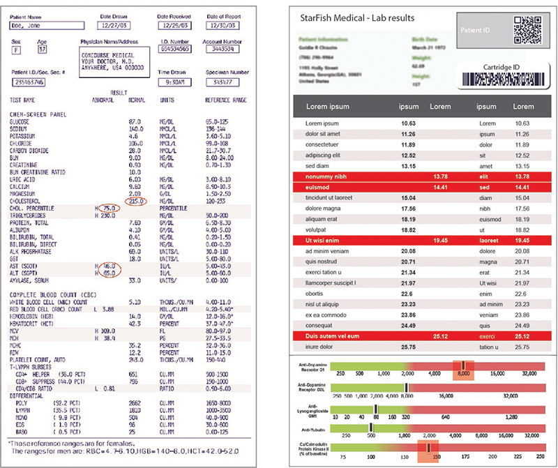
As with any written or graphic output, the design of the results from a processing device is important. Many times, the output from microfluidics is a series of values pertaining to specific components within a biological sample. Interpreting these results can be a daunting task. A mistake in interpreting these figures or even a simple mistake in matching the correct number to the correct variable can result in misdiagnosis of a patient or misinterpretation of the data. Designing better communications can be achieved in several ways. Using color to clearly identify good and bad values (or a range) is one simple technique. Using common graphic elements like scales and sliders can make information quick and intuitive to digest. Go further by designing the device and firmware to give the device the capability of providing only a positive or negative result. While this adds risk to the device itself, it can eliminate user error and greatly simplify the interpretation of the results.

Removing the Cartridge and Sterilizing the Device
Another key consideration in medical device design is ease of cleaning and preparing for the next use. Microfluidics are no different and understanding how important contamination can be to the process can be key to achieving accurate results. The cartridge should be easily removable without leaving any residual fluids in the instrument (fully contained). Removal should be achievable without the user having to touch the inside of the device in order to avoid potential contamination. The device deign should minimize or eliminate part lines, nooks, and crannies where contaminants could get trapped. Trapped dirt, samples (i.e., blood) or fluid can jeopardize the efficacy to the next results.
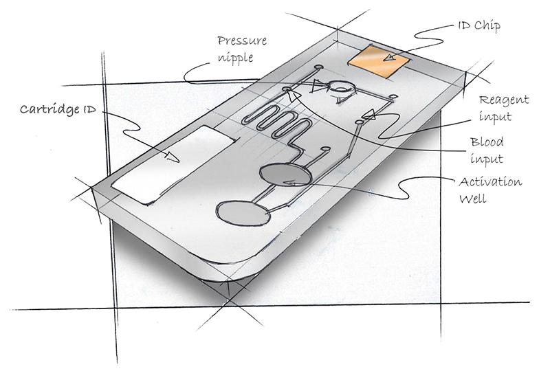
Consider the cartridge in Figure 1. Think about where one would load blood into the cartridge? How about the reagent? Where is it safe to grasp the cartridge without contaminating it? How does it go into the processing device? Can a pipette be inserted into the loading ports? What is up, what is down?

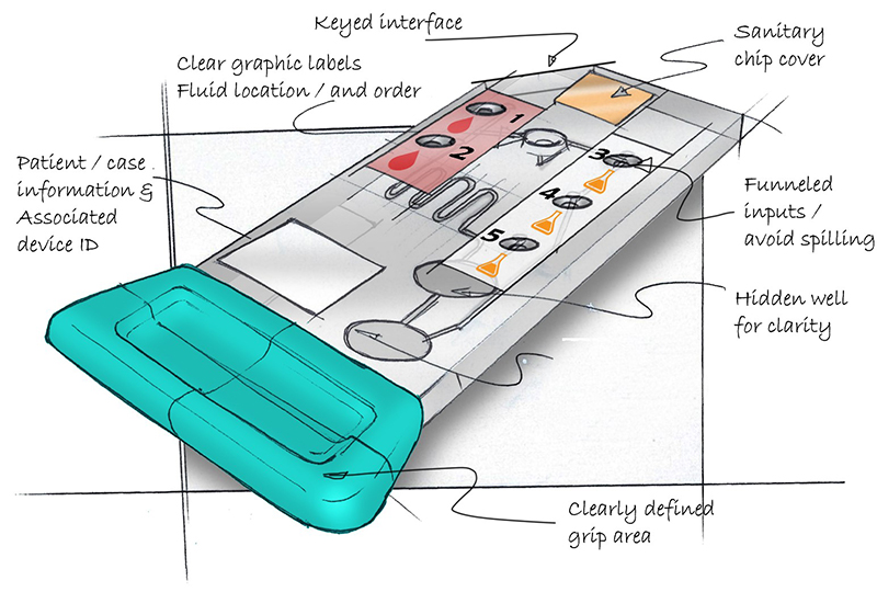
Now consider the cartridge in Figure 2 and ask the same questions.

Overall the usability of the re-designed cartridge is much improved. A clear gripping area intuitively defines where the user can touch and hold the cartridge. Colored labels with graphics depicting blood drops and chemicals clearly define where to load the fluids. Chamfered loading ports create a “funnel” reducing the minute accuracy required when loading the fluids. The asymmetrical design coupled with the finger grip clearly defines orientation and allows the cartridge to only be loaded into the processing device one way. Additional features like QR coded labels for patient assignment and sterilized packaging further help remove the possibility of user error and contamination.
When setting out to design a microfluidics cartridge it is important to look beyond how the cartridge processes a sample to understand all the areas where efficacy can be improved and user error reduced. Looking at the overall use scenario of a microfluidics cartridge and device, one starts to see the complex network of user interactions that are required to achieve a consistent and accurate result. One also sees many opportunities to design a better cartridge, process, and device. Going deeper and observing, understanding, and designing these interactions, can support the microfluidic science with better usability, less user error, and improved efficacy / outcomes.


